Facilitating the Analysis of Immunological Data with Visual Analytic Techniques
Summary
Visual analytics (VA) is a new approach of analyzing data interactively. In this video, we discuss the data overload problem brought on by high-throughput biological experiments, and propose VA as a solution to such problem. The video demonstrates analysis within and between immunological datasets using a VA tool called Tableau.
Abstract
Visual analytics (VA) has emerged as a new way to analyze large dataset through interactive visual display. We demonstrated the utility and the flexibility of a VA approach in the analysis of biological datasets. Examples of these datasets in immunology include flow cytometry, Luminex data, and genotyping (e.g., single nucleotide polymorphism) data. Contrary to the traditional information visualization approach, VA restores the analysis power in the hands of analyst by allowing the analyst to engage in real-time data exploration process. We selected the VA software called Tableau after evaluating several VA tools. Two types of analysis tasks analysis within and between datasets were demonstrated in the video presentation using an approach called paired analysis. Paired analysis, as defined in VA, is an analysis approach in which a VA tool expert works side-by-side with a domain expert during the analysis. The domain expert is the one who understands the significance of the data, and asks the questions that the collected data might address. The tool expert then creates visualizations to help find patterns in the data that might answer these questions. The short lag-time between the hypothesis generation and the rapid visual display of the data is the main advantage of a VA approach.
Protocol
1. Exploration-based Analysis on Tableau
- You have a dataset and you want to explore the various relationships between columns within the data.
- (Figure 1) Import the dataset by clicking on ‘Connect to data’. Choose the data source type and follow instructions to import your dataset.
- (Figure 1) Make sure that the dimensions shelf contains categorical columns while the measures shelf contains numerical columns from your dataset. Sometimes a dimension column such as subject identifier may be listed as measure if it is numerated. Change it to dimensions by right-clicking on it and select ‘Convert to Dimension’. In Figure 1, categorical columns from the dataset such as stimulus concentration level and subject identifiers are correctly placed in dimensions shelf, and the observed concentration of cytokines are correctly placed in measures shelf.
- (Figure 2) If during the analysis process, a calculated field is needed, simply right click in either dimensions or measures shelf, and select ‘Create Calculated Field’. Input the calculation in the formula box with fields combined with functions or mathematical operations. Figure 2 shows how to create a new field called PFD > 2 by aggregating PFD2, PFD3, and PFD4 values.
- (Figure 3) Generate a 2-D plot in Tableau, typically with a dimension and a measure of interest. Since the interface offers simple drag-and-drop interaction, the choice of dimension and measure can be easily changed. Dimensions are typically placed in columns shelf, and measures in rows shelf. In Figure 3, the dimensions shelf contains stimulus concentration level, and the measures shelf contains observed concentration level of cytokines.
- (Figure 3) To differentiate the visualization by a specific dimension, place that dimension label in text, color or size shelf, depending on the nature of the dimension. Text shelf attempts to differentiate data in the visualization by labeling them with textual information provided by the dimension selected. Colour and size shelf will automatically differentiate data by color and size, which can be adjusted with the scroll bar located at the bottom of each shelf. In figure 3, placing genotype in color shelf leads to the separation of three genotypes by distinct colors.
- (Figure 3) Filter the visualization by the specific column variables in other dimension. This can be done by dragging the dimension label into the filter shelf. A window will appear with the list of values to choose from. The selected value will be the only values remaining in the visualization.
- (Figure 4) You may combine visualization with other dimension or measure to produce a matrix of visualization. This can be done by dropping multiple dimensions in columns shelf, and multiple measures in rows shelf. Figure 4 contains an example of two-column visualization matrix by placing two different dimensions in the columns shelf.
- To produce a similar visualization, right click on the current sheet on the bottom left hand corner, and selected ‘duplicate sheet’.
- Iterate the analysis process to identify interesting trends or outliers that may help you generate new hypothesis about the data.
- You have multiple dataset generated from the same source, and want to explore the possible connections between these datasets.
- Place multiple datasets in a same source, i.e. place two spreadsheets into the same workbook, to allow Tableau to connect to these dataset through the same connection.
- (Figure 5) Connect the datasets through logical join of key values, making sure that the dimensions that are the same for multiple datasets are selected. In Figure 5, there are five key values for joining: cell type, stimulus concentration level, stage or group, stimulus, and subject identifier.
- Perform analysis similar to section 1.1.
2. Presentation-based Needs
- You know the relationships between data, but you want to be able to quickly generate a list of visualizations for use in presentation.
- Follow protocol outlined in section 1.1, and annotate the visualizations accordingly.
- Use the export function in Tableau to produce images of visualizations.
- You have generated a set of powerful visualizations in Tableau workbook and want to share that workbook.
- Save the workbook as Tableau packaged workbook and share this file.
- Colleagues without Tableau Desktop can download Tableau Reader to open the packaged workbook. Tableau Reader allows your colleagues to interact with the visualizations that you have created.
3. REPRESENTATIVE RESULTS
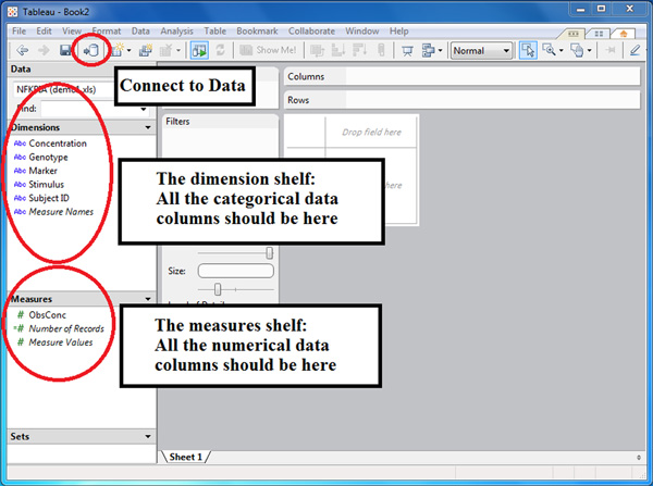
Figure 1. A screenshot of Tableau after importing the spreadsheet named NFKBIA from the Excel file demo.xls. The dimensions and measures shelves were properly populated with the categorical and numerical data, respectively.
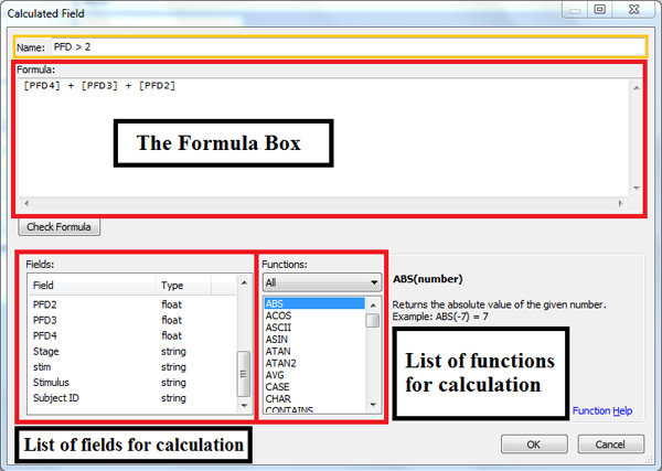
Figure 2. The Calculated Field window is invoked to create a special calculated field to use in Tableau. The list on the bottom left-hand box helps identify possible fields, and the list on the right-hand side contains abbreviation of functions that can be used in the formula. In this example, we wanted to add the values for PFD4, PFD3 and PFD2 to obtain the final value that we refer to as PFD > 2
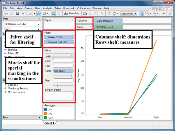
Figure 3. Visualization of stimulus concentration level vs. observed cytokine concentration. The visualization shows a plot of the different concentration levels of the stimulus 3M-002 against the observed concentration of the cytokine TNF-α. The colors of the lines refer to the different genotypes for a single-nucleotide polymorphism in the NFKBIA gene of the individuals in our innate immune study.
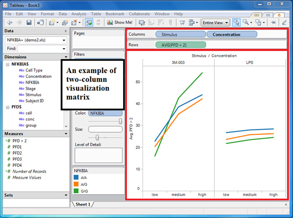
Figure 4. A screenshot of a two-column visualization matrix. We generated a two-column matrix to facilitate a side-by-side comparison of responses to two stimuli, 3M-003 and LPS. The x-axes are the different concentration levels of the two stimuli, and the y-axis plots the values of the calculated field, PFD > 2.
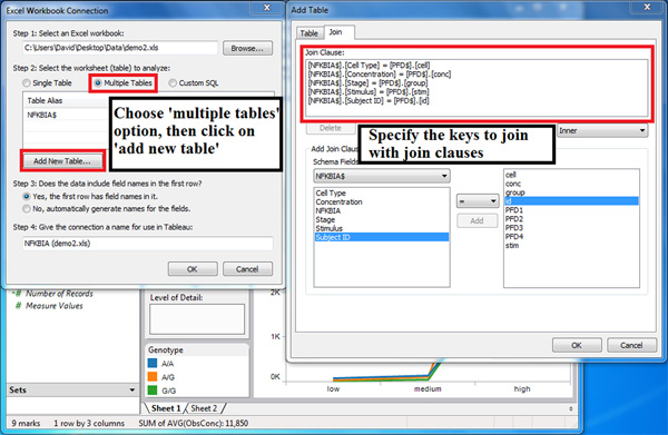
Figure 5. These Tableau dialogue windows illustrate how to connect data recorded in different spreadsheets. Connecting data from different spreadsheets can be accomplished by combining these using logical join clauses of key values.
| Visualization and Analysis Tool | ||||||||||
| Function | Tableau | VIS-STAMP | xmdvtool | GGobi | Starlight | Gapminder | Visulab | InfoVis Toolkit | Geotime | Inspire |
| Parallel coordinate plots | Yes | Yes | Yes | Yes | Yes | No | Yes | Yes | No | No |
| Scatter plot matrixes | Yes | No | Yes | Yes | Yes | No | Yes | No | No | No |
| Dimensional reduction | No | No | Yes | Yes | No | No | No | No | No | No |
| Temporal dimensions | Yes | Yes | No | Yes | Yes | Yes | No | Yes | Yes | No |
| Geospatial dimensions | Yes | Yes | No | No | Yes | Yes | No | No | Yes | No |
| Text mining | No | No | No | No | Yes | No | No | No | No | Yes |
| Direct manipulation of data | Yes | Yes | Yes | Yes | Yes | Yes | Yes | No | Yes | No |
| Filtering | Yes | Yes | Yes | Yes | Yes | Yes | Yes | No | Yes | Yes |
| Extensibility to other platforms (e.g., R) | Yes | No | Yes | Yes | No | Yes | No | Yes | No | No |
| CSV table formats | Yes | Yes | Yes | Yes | No | No | Yes | Yes | Yes | No |
| XML data formats | Yes | No | No | Yes | Yes | No | Yes | Yes | Yes | No |
| Can deal with 10000+ rows | Yes | No | No | No | Yes | No | No | No | No | Yes |
| Documentation | Yes | Yes | Yes | Yes | Yes | Yes | Yes | Yes | Yes | Yes |
| Commercial product | Yes | No | No | No | Yes | No | No | No | Yes | Yes |
Table 1. List of visual analytics tools and some of their features.
Discussion
The advent of high-throughput technology in modern biomedical research led to an explosion of research data that requires a more efficient way of analysis. Visual analytics (VA) is the science of analytical reasoning facilitated by interactive visual interfaces (1). The VA approach restores the analytical power in the hands of human analyst, contrary to the traditional approach to detect patterns by computer. Visual analytics has been applied to research in various fields, such as defense research (1) and hurricane trends (2). So far, there are only a few examples of VA applications in biology (3). We demonstrated in this video article that VA is an approach that can be added to the biologist’s arsenal of analysis tools. Many VA softwares are available ranging from those that are in development in academic labs to those that are commercially-available. For our work on neonatal innate immunity (4), we chose Tableau because of its suitability in analyzing spreadsheet-style datasets available in the lab. Other VA tools, some of which we mentioned in our video article, may be more appropriate for other types of biological data. We listed the functions and characteristics of some of the more popular VA tools in Table 1. This list is not meant to be exhaustive because it is beyond the scope of our study, but it should be a good starting point for scientists to determine the suitable VA tool for their specific datasets.
There are two major points about VA that we would like to highlight. One, the VA approach is intended as an exploration process by helping the analyst quickly spot patterns such as general trends and outliers in the data. The main focus of VA is to provide a powerful visualization technique for large datasets. It is not an alternative to statistical analysis. In fact, most of the VA tools are very limited in their ability to perform statistical analysis although we anticipate this to change in the near future. The second point we want to mention is that the data pre-processing prior to importing the dataset to a VA tool is crucial for the success of the analysis. Bear in mind that data presented in a human-readable fashion in spreadsheets are sometimes different from a machine-readable format. Data pre-processing can be a time-consuming step, often requiring massive transformation of the data, if the original format of the data is not suitable to the VA tool. We highly recommend the careful planning of data entry and encoding to allow flexible and efficient uploads to downstream analysis software tools such as those available in VA.
Divulgazioni
The authors have nothing to disclose.
Acknowledgements
We would like to thank the members of Vancouver Institute of Visual Analytics (VIVA) for offering comments and advice for the project. In particular, we would like to thank John Dill, Brian Fisher, and David Darvill. We would also like to thank the members of the Kollmann lab for their support and helpful discussions. This work was supported in part by National Institute of Allergy and Infectious Diseases, National Institute of Health Grant N01 AI50023; AllerGen NCE Grants 07-A1A and 07-B2B; and the Michael Smith Foundation for Health Research. T.R.K. is supported in part by a Career Award in the Biomedical Science from the Burroughs Wellcome Fund ad by a Canadian Institutes for Health Research Training Grant in Canadian Child Health Clinician Scientist Program, in partnership with Sick-Kids Foundation, Child and Family Research Institute (British Columbia), Women and Children’s Health Research Institute (Alberta), and Manitoba Institute of Child Health.
Riferimenti
- Thomas, J., Cook, K. Illuminating the Path: The Research and Development Agenda for Visual Analytics. , (2005).
- Steed, C., Swan, J., Jankun-Kelly, T., Fitzpatrick, P. Guided Analysis of Hurricane Trends Using Statistical Processes Integrated with Interactive Parallel Coordinates. IEEE Symposium on Visual Analytics Science and Technology. , 19-26 (2009).
- Saraiya, P., North, C., Lam, V., Duca, K. An Insight-Based Longitudinal Study of Visual Analytics. IEEE Transactions on Visualization and Computer Graphics. 12, 1511-1522 (2006).
- Kollmann, T. R., Crabtree, J., Rein-Weston, A., Blimkie, D., Thommai, F., Wang, X. Y., Lavoie, P. M., Furlong, J., Fortuno, E. S., Hajjar, A. M., Hawkins, N. R., Self, S. G., Wilson, C. B. Neonatal innate TLR-mediated responses are distinct from those of adults. J. Immunol. 183, 7150-7160 (2009).

